Friday, June 23, 2017

WPF Tip #14 - Extended WPF Toolkit - The CalculatorUpDown Control

In this tip, we will continue to explore the free controls available in the Extended WPF Toolkit Community Edition.

The CalculatorUpDown control is a hybrid of sorts. It takes the functionality of an up/down numeric control and adds a dropdown button. Clicking on the dropdown button pops open a Calculator control. The output of the calculator displays in its window as well as in the text portion of the CalculatorUpDown.

Let's take a simple example of the control's use and walk through a few of the properties and how they impact the control's functionality. Here is the XAML:
<tk:CalculatorUpDown Grid.Row="1" Height="32" VerticalAlignment="Top" FormatString="C2" Watermark="Calculate!" Increment=".01" Maximum="9999.99" Minimum="0.01"/>
Upon first launching the window, this is how the control looks:
calc0
There is a numeric up/down with a watermark reading "Calculate!" and a dropdown button to open the calculator control. Let's click the up button to start.
calc0a
The Increment property is set to ".01" and the FormatString is "C2", so our value has incremented to $0.01 or 1 U.S. cent. You'll notice that the down button is now disabled because the Minimum property is currently equal to the control's Value.

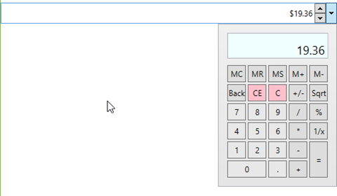
Now to explore the calculator control a little. Click the dropdown button and enter a calculation.
calc1
As you use the calculator, you will notice that the calculator window updates as you enter and calculate values, but the textbox of the control only updates to show results of calculations. If the calculated value falls outside the Maximum or Minimum properties, it will default to those Max/Min values.

There was no code required on our part to add this rich functionality or our application, only the XAML markup seen above. You certainly could take this a step further by adding some data binding and leveraging other properties that the control exposes to do things like allowing the user to change the number format.

Happy coding!

del.icio.us Tags: ,,

Tuesday, June 13, 2017

WPF Tip #13 - Extended WPF Toolkit - ColorCanvas with MVVMLight, Binding and EventToCommand

In Tip #12, we used a ColorCanvas control in a SplitButton to change the Background color of the SplitButton using an event in the code behind. In this tip, we will do the same thing with data binding and commands using MVVMLight.

The first step is to add the MVVMLight NuGet package to the project:

image

Adding the package will add and update several classes in the project. We now have a MainViewModel and ViewModelLocator inside a ViewModel folder. The locator class exposes each ViewModel in the project so they can be bound in your views. To make the locator discoverable to the views in the project, MVVMLight added a new resource to the App.xaml:

<Application.Resources>
   <ResourceDictionary>
     <vm:ViewModelLocator x:Key="Locator" d:IsDataSource="True" xmlns:vm="clr-namespace:WpfApp1.ViewModel" />
   </ResourceDictionary>
</Application.Resources>

Now lets start with the changes we have to make. First remove the event handler from the MainWindow.xaml.cs. The next step is to replace that functionality with some decoupled logic in the MainViewModel. Two things are needed:

  • A ButtonBrush property to bind the SplitButton's Background property.
  • A ChangeBrushColorCommand RelayCommand to bind to the ColorChanged event of the ColorCanvas.

An OnColorChanged method is added to do the work needed when the RelayCommand is invoked. These are hooked up in the constructor, along with some default colors for the SplitButton. I made the button different colors at design-time and runtime as a way to validate that my binding code isn't broken. Here's the complete MainViewModel implementation:

public class MainViewModel : ViewModelBase
{
     public MainViewModel()
     {
         if (IsInDesignMode)
         {
             ButtonBrush = new SolidColorBrush(Colors.LightGray);
         }
         else
         {
             ButtonBrush = new SolidColorBrush(Colors.LightSkyBlue);

            ChangeBrushColorCommand = new RelayCommand<Color?>(OnColorChanged);
         }
     }

    public SolidColorBrush ButtonBrush { get; set; }

    internal void OnColorChanged(Color? p_Param)
     {
         if (p_Param.HasValue)
         {
             ButtonBrush = new SolidColorBrush(p_Param.Value);
         }
         else
         {
             ButtonBrush = new SolidColorBrush(Colors.Transparent);
         }

        RaisePropertyChanged(nameof(ButtonBrush));
     }

    public RelayCommand<Color?> ChangeBrushColorCommand { get; private set; }
}

The next thing we need is a converter class to convert the event args of the ColorChanged event to the Color? parameter type of our RelayCommand. SelectedColorChangedToColorConverter implements the IEventArgsConverter in MvvmLight. It's similar to value converters you may have created for data binding in WPF (see WPF Tip #4).

public class SelectedColorChangedToColorConverter : IEventArgsConverter
{
     public object Convert(object value, object parameter)
     {
         var args = (RoutedPropertyChangedEventArgs<Color?>)value;

        return args.NewValue ?? Colors.Transparent;
     }
}

Finally, lets make a few changes to the MainWindow view.

Set the DataContext for the Window using the ViewModelLocator:

DataContext="{Binding Main, Source={StaticResource Locator}}"

Add the converter to the Window.Resources:

<Window.Resources>
     <ResourceDictionary>
         <local:SelectedColorChangedToColorConverter x:Key="SelectedColorChangedToColorConverter" />
     </ResourceDictionary>
</Window.Resources>

Update the SplitButton to bind its Background property and the ColorCanvas to use the MVVMLight EventToCommand trigger, hooking up our RelayCommand through the converter.

<tk:SplitButton Content="Pick a Color" Height="32" Width="120" Background="{Binding ButtonBrush}">
     <tk:SplitButton.DropDownContent>
         <tk:ColorCanvas x:Name="MainColorCanvas">
             <i:Interaction.Triggers>
                 <i:EventTrigger EventName="SelectedColorChanged">
                     <command:EventToCommand Command="{Binding ChangeBrushColorCommand, Mode=OneWay}"
                                             EventArgsConverter="{StaticResource SelectedColorChangedToColorConverter}"
                                             PassEventArgsToCommand="True"/>
                 </i:EventTrigger>
             </i:Interaction.Triggers>
         </tk:ColorCanvas>
     </tk:SplitButton.DropDownContent>
</tk:SplitButton>

That's it!. Same functionality, but now with better separation between view and code.

Happy coding! (P.S. - I hope to get some proper code formatting hooked up to Blogger soon… or maybe a new blogging platform. Thanks for bearing with me.)

Wednesday, June 7, 2017

WPF Tip #12 - Extended WPF Toolkit - ColorCanvas

Last time in Tip #11, I explained the Extended WPF Toolkit and the different versions that are available. In the quick-n-dirty example, I added a SplitButton with a ColorCanvas that displays when opening the dropdown portion of the buttom.

In this tip, we are going to add just a few lines of code to take the color selected in the ColorCanvas and apply it as the background color of the SplitButton.

Let's start with the Xaml. There are two changes needed here (highlighted below). The first is to name the button so it can be referenced from the application's code. The second is adding a handler to the ColorCanvas' SelectedColorChanged event. This event fires every time the color changes on the canvas and provides the OldValue and NewValue as parameters in the event.

<tk:SplitButton x:Name="mainSplitButton" Content="Pick a Color" Height="32" Width="120">
     <tk:SplitButton.DropDownContent>
         <tk:ColorCanvas SelectedColorChanged="ColorCanvas_OnSelectedColorChanged" />
     </tk:SplitButton.DropDownContent>
</tk:SplitButton>

In the code behind for the Window, I have added the ColorCanvas_OnSelectedColorChanged event handler with some code to set the SplitButton's background color to a new SolidColorBrush the color of the NewValue selected on the ColorCanvas, provided it's not null.

private void ColorCanvas_OnSelectedColorChanged(object sender, RoutedPropertyChangedEventArgs<Color?> e)
{
     if (e.NewValue.HasValue)
     {
         mainSplitButton.Background = new SolidColorBrush(e.NewValue.Value);
     }
}

You could add an else condition to handle nulls by setting the background color back to some default color. Here's what the end result looks like.

colorcanvas

If you were following the MVVM pattern in your application, you would handle this through data binding and commands. In Tip #13, we will add MVVMLight to the mix and rework the example to follow this pattern.


del.icio.us Tags: ,,

Thursday, June 1, 2017

WPF Tip #11 - Free Controls with the Extended WPF Toolkit Community Edition

Everyone loves free things. When it comes to WPF controls, there is a wide selection of 3rd party components from which to choose: Telerik, Infragistics, DevExpress, etc. If you're an independent developer or a small business on a tight budget, the Extended WPF Toolkit, maintained by Xceed, is a great choice.

Currently available on Codeplex, the Community Edition of the toolkit includes nearly 50 WPF controls. These are just a few:
Xceed also offers two paid versions of the toolkit with additional controls and technical support, the Plus Edition and the Business Suite for WPF.

The latest release of the community edition is 3.0.0 and was released in Dec. 2016. I have recently contacted Xceed to inquire about their plans for the future of the toolkit and whether it will be migrated to GitHub or another host. As you may be aware, Codeplex is shutting down this year. See Brian Harry's post about the transition to GitHub for Codeplex projects.

EDIT: A representative replied to me to inform me that there will be an announcement about the migration of the Extended WPF Toolkit from Codeplex within a month.

In the spirit of including some code in these tips, here is a quick sample of the little bit of code required to add a SplitButton that opens a ColorPicker control for the user:
<Window x:Class="WpfApp1.MainWindow"
         xmlns="
http://schemas.microsoft.com/winfx/2006/xaml/presentation"
         xmlns:x="http://schemas.microsoft.com/winfx/2006/xaml"
         xmlns:d="http://schemas.microsoft.com/expression/blend/2008"
         xmlns:mc="http://schemas.openxmlformats.org/markup-compatibility/2006"
         xmlns:local="clr-namespace:WpfApp1"
         xmlns:tk="
http://schemas.xceed.com/wpf/xaml/toolkit"
         mc:Ignorable="d"
         Title="MainWindow" Height="350" Width="525">
     <Grid>
         <tk:SplitButton Content="Pick a Color" Height="32" Width="120">
             <tk:SplitButton.DropDownContent>
                 <tk:ColorCanvas />
             </tk:SplitButton.DropDownContent>
         </tk:SplitButton>
     </Grid>
</Window>
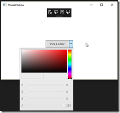
The end result when running the app looks like this with the button open:
image
The color picker itself require a little more code to setup. Let's take a look at its use in our next tip.

Happy coding!

del.icio.us Tags: ,