Currently available on Codeplex, the Community Edition of the toolkit includes nearly 50 WPF controls. These are just a few:
- CheckListBox
- ColorPicker
- DataGrid
- DateTimePicker
- DropDownButton
- MaskedTextBox
- RichTextBox
- WatermarkTextBox
- Wizard
The latest release of the community edition is 3.0.0 and was released in Dec. 2016. I have recently contacted Xceed to inquire about their plans for the future of the toolkit and whether it will be migrated to GitHub or another host. As you may be aware, Codeplex is shutting down this year. See Brian Harry's post about the transition to GitHub for Codeplex projects.
EDIT: A representative replied to me to inform me that there will be an announcement about the migration of the Extended WPF Toolkit from Codeplex within a month.
In the spirit of including some code in these tips, here is a quick sample of the little bit of code required to add a SplitButton that opens a ColorPicker control for the user:
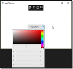
<Window x:Class="WpfApp1.MainWindow"The end result when running the app looks like this with the button open:
xmlns="http://schemas.microsoft.com/winfx/2006/xaml/presentation"
xmlns:x="http://schemas.microsoft.com/winfx/2006/xaml"
xmlns:d="http://schemas.microsoft.com/expression/blend/2008"
xmlns:mc="http://schemas.openxmlformats.org/markup-compatibility/2006"
xmlns:local="clr-namespace:WpfApp1"
xmlns:tk="http://schemas.xceed.com/wpf/xaml/toolkit"
mc:Ignorable="d"
Title="MainWindow" Height="350" Width="525">
<Grid>
<tk:SplitButton Content="Pick a Color" Height="32" Width="120">
<tk:SplitButton.DropDownContent>
<tk:ColorCanvas />
</tk:SplitButton.DropDownContent>
</tk:SplitButton>
</Grid>
</Window>

The color picker itself require a little more code to setup. Let's take a look at its use in our next tip.
Happy coding!
No comments:
Post a Comment
Note: Only a member of this blog may post a comment.