IconButton derives from a WPF Button and adds the ability to optionally place an Image to the left or right of your button's Content. There are a handful of properties available on top of the existing Button properties - Icon and IconBackground plus properties to change the button's appearance when users mouse over or press the button:
- MouseOverBackground
- MouseOverForeground
- MouseOverBorderBrush
- MousePressedBackground
- MousePressedForeground
- MousePressedBorderBrush
<xctk:IconButton Content="Launch Me" Padding="4"
                  HorizontalAlignment="Center" VerticalAlignment="Center"
                  IconLocation="Right">
     <xctk:IconButton.Icon>
         <Image Source="/WpfApp1;component/Images/Launchpad_Icon.png"
                Width="16" Margin="4,0,0,0"/>
     </xctk:IconButton.Icon>

</xctk:IconButton>
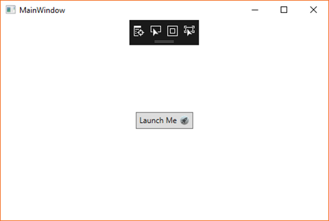
The result is a window with a single "Launch Me" IconButton. There's an Apple-style launch icon to the right of the text set in the Content property. The image I used is a .png file in my project's Images folder set as a Resource. If you wanted to deploy the actual .png file, you would update the file to be "Content" and set the Image's Source property to "Images/Launchpad_Icon.png". This is the same practice you would use for any WPF image source.
All of these properties can be set up via MVVM, data binding and code in your ViewModels to load the image and set its location at runtime based on other application configuration or user preferences.
Here's is a look at the window at runtime:

It's a simple control that can save you a little bit of control templating. If this is something you could use in your project, the toolkit is free and available on NuGet.
Happy coding!
del.icio.us Tags: wpf,extended wpf toolkit
Nice and simple. I just used your example in my code :)
ReplyDeleteThanks for the post.