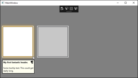
In this tip, we're going to create a custom control derived from ToolTip to create a headered tooltip with an icon. Creating it as a custom control makes it trivial to add the tooltip to any control in your project.
This simple example will include a specific icon and has a property to hide/show the icon. I'll explain later how you could update the control's implementation to accept an icon through binding, enabling different icons across different uses.
The first step is to create the custom control class that inherits from ToolTip. Here is the implementation for HeaderedToolTip.
[TemplatePart(Name = PART_TooltipHeader, Type = typeof(TextBlock))]

[TemplatePart(Name = PART_TooltipIcon, Type = typeof(ContentControl))]

[TemplatePart(Name = PART_TooltipContents, Type = typeof(TextBlock))]

public class HeaderedToolTip : ToolTip

{
     private const string PART_TooltipHeader = "PART_TooltipHeader";
     private const string PART_TooltipIcon = "PART_TooltipIcon";
     private const string PART_TooltipContents = "PART_TooltipContents";
     private TextBlock _headerBlock = null;
     private ContentControl _iconControl = null;
     private TextBlock _contentsBlock = null;
     static HeaderedToolTip()
     {
         DefaultStyleKeyProperty.OverrideMetadata(typeof(HeaderedToolTip), new FrameworkPropertyMetadata(typeof(HeaderedToolTip)));
     }
     public string HeaderText
     {
         get => (string)GetValue(HeaderTextProperty);
         set => SetValue(HeaderTextProperty, value);
     }
     // Using a DependencyProperty as the backing store for HeaderText. This enables animation, styling, binding, etc.
     public static readonly DependencyProperty HeaderTextProperty =
         DependencyProperty.Register("HeaderText", typeof(string), typeof(HeaderedToolTip), new UIPropertyMetadata(string.Empty));
     public string ContentText
     {
         get => (string)GetValue(ContentTextProperty);
         set => SetValue(ContentTextProperty, value);
     }
     // Using a DependencyProperty as the backing store for HeaderText. This enables animation, styling, binding, etc.
     public static readonly DependencyProperty ContentTextProperty =
         DependencyProperty.Register("ContentText", typeof(string), typeof(HeaderedToolTip), new UIPropertyMetadata(string.Empty));
     public Visibility IconVisibility
     {
         get => (Visibility)GetValue(IconVisibilityProperty);
         set => SetValue(IconVisibilityProperty, value);
     }
     // Using a DependencyProperty as the backing store for IconVisibility. This enables animation, styling, binding, etc.
     public static readonly DependencyProperty IconVisibilityProperty =
         DependencyProperty.Register("IconVisibility", typeof(Visibility), typeof(HeaderedToolTip), new UIPropertyMetadata(Visibility.Collapsed));
     public override void OnApplyTemplate()
     {
         base.OnApplyTemplate();
         _headerBlock = GetTemplateChild(PART_TooltipHeader) as TextBlock;
         _iconControl = GetTemplateChild(PART_TooltipIcon) as ContentControl;
         _contentsBlock = GetTemplateChild(PART_TooltipContents) as TextBlock;
     }

}
Some of this code is not necessary for our tooltip, but I added it here to illustrate how you can get a reference to parts of your custom control within the class in OnApplyTemplate(). This would be useful if you need to respond to any events fired from the controls that make up your custom controls. You would add the event handler hooks here after resolving them through GetTemplateChild.
The next step is to set up the template in a ResourceDictionary. Here is the XAML markup from my ToolTipResourceDictionary.xaml file.
<ResourceDictionary xmlns="http://schemas.microsoft.com/winfx/2006/xaml/presentation"
                     xmlns:x="http://schemas.microsoft.com/winfx/2006/xaml"
                     xmlns:local="clr-namespace:ToolTipSample.Controls">
     <ResourceDictionary.MergedDictionaries>
         <ResourceDictionary Source="..\Images\vector_Information.xaml"/>
     </ResourceDictionary.MergedDictionaries>
     <Style TargetType="{x:Type local:HeaderedToolTip}">
         <Setter Property="Template">
             <Setter.Value>
                 <ControlTemplate TargetType="{x:Type local:HeaderedToolTip}">
                     <Border BorderThickness="2" BorderBrush="Black">
                         <Grid Background="Ivory">
                             <Grid.RowDefinitions>
                                 <RowDefinition Height="Auto"/>
                                 <RowDefinition Height="*"/>
                             </Grid.RowDefinitions>
                             <Grid.ColumnDefinitions>
                                 <ColumnDefinition Width="*"/>
                                 <ColumnDefinition Width="Auto"/>
                             </Grid.ColumnDefinitions>
                             <TextBlock Text="{TemplateBinding HeaderText}"
                                     x:Name="PART_TooltipHeader"
                                    FontWeight="Bold"
                                    VerticalAlignment="Bottom"
                                    Margin="4"
                                    HorizontalAlignment="Left"/>
                             <ContentControl Grid.Column="1"
                                         HorizontalAlignment="Right"
                                         VerticalAlignment="Top"
                                         x:Name="PART_TooltipIcon"
                                         Content="{StaticResource vector_Information}"
                                         Visibility="{TemplateBinding IconVisibility}"
                                         Height="16" Width="16"
                                         Margin="4"/>
                             <TextBlock Grid.Row="1"
                                    Grid.ColumnSpan="2"
                                    Margin="4,12,4,6"
                                    x:Name="PART_TooltipContents"
                                    Text="{TemplateBinding ContentText}"
                                    TextWrapping="Wrap"
                                    MaxWidth="200"/>
                         </Grid>
                     </Border>
                 </ControlTemplate>
             </Setter.Value>
         </Setter>
     </Style>

</ResourceDictionary>
The final step is to consume our custom tooltip in a control somewhere in our project. I have create a Window containing a horizontally aligned StackPanel with two Grids. Each grid contains a border that glows a different color when you mouse over it, one blue, one gold. The second grid is disabled to demonstrate the ToolTipService.ShowOnDisabled attached property. Each Grid.ToolTip contains an instance of our HeaderedToolTip custom tooltip control.
<Window.Resources>
         <ResourceDictionary Source="..\ToolTipResourceDictionary.xaml"/>
     </Window.Resources>
     <StackPanel Orientation="Horizontal">
         <Grid ToolTipService.ShowOnDisabled="True">
             <Border Width="180" Height="180"
                 Margin="10" Background="Transparent"
                 BorderBrush="White" BorderThickness="2" Opacity="1.0">
                 <Border.Style>
                     <Style TargetType="{x:Type Border}">
                         <Style.Triggers>
                             <Trigger Property="IsMouseOver" Value="True">
                                 <Setter Property="Effect">
                                     <Setter.Value>
                                         <DropShadowEffect ShadowDepth="0" Color="Gold" Opacity="1" BlurRadius="20"/>
                                     </Setter.Value>
                                 </Setter>
                             </Trigger>
                         </Style.Triggers>
                     </Style>
                 </Border.Style>
                 <TextBox HorizontalAlignment="Stretch" VerticalAlignment="Stretch" Margin="4"/>
             </Border>
             <Grid.ToolTip>
                 <local:HeaderedToolTip HeaderText="My first fantastic header."
                                              ContentText="Some tooltip text. This could get really long."
                                              IconVisibility="Visible"/>
             </Grid.ToolTip>
         </Grid>
         <Grid IsEnabled="False" ToolTipService.ShowOnDisabled="True">
             <Border Width="180" Height="180"
                 Margin="10" Background="Transparent"
                 BorderBrush="White" BorderThickness="2" Opacity="1.0">
                 <Border.Style>
                     <Style TargetType="{x:Type Border}">
                         <Style.Triggers>
                             <Trigger Property="IsMouseOver" Value="True">
                                 <Setter Property="Effect">
                                     <Setter.Value>
                                         <DropShadowEffect ShadowDepth="0" Color="Blue" Opacity="1" BlurRadius="20"/>
                                     </Setter.Value>
                                 </Setter>
                             </Trigger>
                         </Style.Triggers>
                     </Style>
                 </Border.Style>
                 <TextBox HorizontalAlignment="Stretch" VerticalAlignment="Stretch" Margin="4"/>
             </Border>
             <Grid.ToolTip>
                 <local:HeaderedToolTip HeaderText="My second fantastic header."
                                              ContentText="Some tooltip text. This could get really, really long."
                                              IconVisibility="Collapsed"/>
             </Grid.ToolTip>
         </Grid>
     </StackPanel>
That's it. Here's a look at the tooltip in action. Please excuse my vector paragraph image in place of an actual Info icon.
Of course, in your actual implementation, data like the header's tooltip and contents will be driven from ViewModel data binding.
If you want to allow a custom icon for each use of the HeaderedToolTip, you would add an Image as another DependencyProperty on the custom control class and as another TemplatePart in the ResourceDictionary.
That's all for this WPF Tip. You can take any of these concepts and apply them to other custom controls you may need in your own applications. For more information about creating controls, check out Microsoft Docs.
Happy coding!
